Archive for January, 2008
January 29th, 2008
 Canadian Club, that once-respected whiskey that got pushed out of drinkers’ consciousness by the vodka tidal wave on one hand and the emergence of boutique ryes and bourbons on the other, is trying to make a comeback. The brand, now owned by Jim Beam, is running a catchy ad campaign in magazines like Esquire and GQ. Naturally, I wanted to include here an example of one of the ads, but I couldn’t for reasons I’ll explain in a minute.
The ads are fun. They play on the same sensibility that fueled the comeback of old-school beer brands like PBR, Schlitz and Narragansett. Their images, which look like faded, creased photos from the ’60s and ’70s, show men of a bygone era doing “man” things like fishing, playing in a band and partying with babes in a shag-carpeted rec room. Oh, and drinking C.C. in heavy-bottomed rocks glasses, of course. The ad with the guys fishing reads, “Your dad was not a metrosexual. He didn’t do pilates. Moisturize. Or drink pink cocktails. Your dad drank whiskey cocktails. Made with Canadian Club. Served in a rocks glass. They tasted good. They were effortless. Damn right your dad drank it.”
Wow. Is that a bitch slap. To the modern man. Or what?
The thing I love about these ads, besides their authentically retro look and their towel-snapping text, is that they are nothing like other whiskey ads, whose warmly lit still-life-with-bottle aesthetic evokes heritage and taste. Yawn. The C.C. ads are saying, ‘Hey, remember when drinking whiskey wasn’t about drinking whiskey but about what was happening while you were drinking whiskey?’ Yeah!
Another reason these ads resonated with me is that, by coincidence, I recently tasted C.C. for the first time in ages. A couple we know had a small gathering at their house. There was nary a mixology book in sight. Just a big stone fireplace and a magically replenishing pitcher of Manhattans. Sitting in an armchair sipping my drink, I asked my host, “What kind of whiskey did you use?” With a little smirk and a shrug, he said, “Canadian Club,” and awaited the commentary of the Booze Snobs. Scott and I looked at each other, then back at our host. “It’s good!” Then we all went back to discussing the presidential election.
Unfortunately, my budding appreciation for C.C. soured when the Jim Beam legal department reared its ugly head. You see, I emailed the C.C. brand manager to ask for permission to use an ad image from the website for this post. Upon his request, I even described the post’s content, saying that it would be a commentary on the new ad campaign and favorable toward the product itself. But then things got stupid. “Sounds great!” he replied. “I just spoke with my legal team. They asked that we get to see the article before it’s run. Will this be ok with you? I will be able to have this approved within a matter of hours once you submit.”
Once I submit? Oh, that’s rich. Let me get this straight, buddy. I’m writing an article about your whiskey brand on a website frequented by the exact demographic you’re targeting, and your lawyers have to approve my use of your ad as an illustration? What, free advertising isn’t enough for you people? You have to have editorial control, too?
Yeah, I know. Maybe I should’ve behaved like every other blogger in the universe and simply grabbed a jpeg from the Canadian Club site without asking first. But my dad taught me to be conscientious. And he drinks Dewar’s.
Posted in Booze in the news, Whiskey | 18 Comments »
January 25th, 2008
Things I learned this week:
1. Jeff “Beachbum” Berry’s Grog Blog features a post titled “Monks + Drunks x Sisterhood = the Pago Pago Cocktail.” It seems Berry made the acquaintance of some of the ladies of LUPEC Boston (that’s the Boston chapter of Ladies United for the Preservation of Endangered Cocktails) a couple of months ago when he was in town for the Sippin’ Safari. He became intrigued by the cocktails that LUPEC Boston and drinkboston.com created for a Chartreuse event at Green Street back in August.
“Inspired by LUPEC Boston’s creations,” writes the tiki guru, “we combed through our cocktail library in search of vintage tropical drinks that call for Chartreuse. In a 1940 book entitled The How And When, we finally found a good one: the Pago Pago. To make it, place 1 ounce of diced fresh pineapple in your cocktail shaker, then muddle the pineapple in 1/2 ounce fresh lime juice. Add 1/4 ounce white creme de cacao, 3 teaspoons green Chartreuse, and 1 1/2 ounces gold Puerto Rican rum. Shake well with ice cubes and strain into a cocktail glass.”
I have only tasted this drink in my mind, but it’s one of the most delicious imaginary cocktails I’ve ever had. I vow to mix one up for myself soon.
2. Blackberrying me from the bar at KO Prime, a friend of mine made me aware of the steak house’s “Retro Sundays.” He said he and his wife were drinking Pink Squirrels (creme de noyaux, creme de cacao and cream). Apparently, the bartenders robe up like Hugh Hefner, Chef Jamie Bisonnette parades around in a cartoonish toque, and the dinner menu includes old-school steak house specialties like all-you-can-eat prime rib, Oysters Rockefeller and shrimp cocktail. Cool.
3. Meanwhile, speaking of old-school … over at the Independent, bartender Evan Harrison is dreaming up a special menu of “cheap scotch cocktails.” It seems the bar has a surplus of Cluny blended scotch on hand (in 1.5 liter plastic bottles of course), and, well, Evan’s going to do his own version of your grandfather’s night out. I took a sniff from the Cluny bottle during a recent visit, and it smelled like … it smelled like the first time I ever smelled whiskey: dangerous and slightly sickening. I’m anxiously awaiting that menu. (Oh, and by the way, Evan also re-did the Indo’s website, and I think it looks damn cool.)
Posted in Cocktails, Liqueur, Whiskey | 4 Comments »
January 18th, 2008
I love visiting bars. I hate visiting bar websites. One of the little-known drawbacks of being a drinks writer is the amount of time you spend searching for the Skip Intro button on restaurant, club and bar homepages. These sites are notorious for forcing on you a little Flash movie of the lounge area, or slide show of signature dishes and cocktails, complete with urbane musical accompaniment, before you are allowed to see the navigation. Then, when you finally get past the intro, you find yourself in a site that uses frames — those little windows, popular in 1998, that you have to scroll through — rather than separate web pages for each section. And don’t even get me started on menus in PDF. Nearly every bar and restaurant on the planet makes you download their menu to your desktop and view it in Acrobat. Is it asking too much to simply put the text on the actual web page? Oh, but wait, you’d need a web expert to hack into those damn frames…
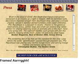 I didn’t set out to pick on anyone in particular here. The examples above were easy to find, and there are dozens more like them. That’s my point. Bad websites are rampant in this industry.
Regarding what I said about frames — it’s not that these sites look out of date. Most of them are quite slick. It’s that they act out of date. Mr. or Ms. General Manager, that flash intro may have seemed awesome the first time your web developer played it for you, but after the ninth time, when all you’re trying to do is take a quick look at the wine list, it’s annoying as hell. And the shoddy navigation on some of these sites can be comical. On the Beehive’s website, for example, click on Special Events (after watching that cool intro, of course). Where does that take you? Not to a list of special events, as you might expect, but to a page that says, “Beehive Special Events. Click here for more information.” Click there, and yet a third page opens in a new window with the info you’re looking for. Incidentally, I will be at the Beehive on the 27th to see Titler, who has a completely hallucinogenic website.
I know, restaurant folks don’t tend to have their fingers on the pulse of web technology. That’s why they’re mixing cocktails, cooking food and serving dinner, not sitting in an office. But what they need to understand is that if a potential customer visits their restaurant’s website, he probably landed there only after Googling, say, “sushi, Boston,” reading a few reviews on Chowhound and local blogs, and asking around the office to see if anyone has been to the place. At that point, all he wants to do is check out the latest menu and find the T stop nearest the destination. My advice? Give him a clean, easy-to-navigate website where he can readily find that info, because he wants to be wowed by your food, drinks and service, not your homepage.
Posted in Books & resources, Boston bars | 7 Comments »
January 11th, 2008
 I attended a party recently that Beija Cachaca hosted at Eastern Standard. Cachaca is Brazilian rum. It’s made from sugar cane juice instead of the more common base for rum, molasses. Kevin Beardsley and Steve Diforio, the two fresh-out-of-college guys who started the company that formulated and now imports and markets Beija, declare that “in 2007 the U.S. government officially designated Beija as the World’s First Virgin Cane Rum.”
I wondered how “virgin cane rum” differs from 10 Cane, another new rum made from virgin sugar cane, or rhum agricole, or other cachacas, for that matter. Apparently, the designation hinges on the fact that the distillation process begins a mere 10 hours after the sugar cane is harvested and pressed. “Other brands allow their sugarcane to wallow in the sun for days before distilling it.” Horrors!
OK, despite the tone of the marketing kit (and the annoyingly predictable packaging featuring “an alluring female figure in profile”), the product is pretty solid. For an 80 proof spirit, it has absolutely no burn, especially compared to the harshness that I’ve heard is the defining characteristic of most cachacas available in the U.S. To me, Beija smelled a lot like sake and had a very soft, somewhat sake-like, dryly fruity taste.
Like most people, I had only ever had cachaca in a Caipirinha (together now, that’s “ky-pir-EEN-ya”), a refreshing mixture of cachaca and muddled lime juice and sugar over ice that is competing with the Mojito for Most Popular Latin American Cocktail. The whole idea of the event (besides getting people like me to write about Beija) was to try cachaca in ways that break free from the Caipirinha. My favorite among the cocktails that Jackson Cannon and his bar crew mixed that night was a variation on the Red Hook: 2 oz Beija (instead of rye) and a 1/2 oz each of Punt e Mes and Luxardo Maraschino. Really nice and mellow. A few of us also tried a Negroni with Beija substituted for gin. We agreed that it didn’t quite work; the Campari overpowered the softer spirit.
Other Boston bars serving Beija are Om in Harvard Square, District and the Vintage Lounge.
Posted in Cocktails, Rum | 12 Comments »
January 6th, 2008

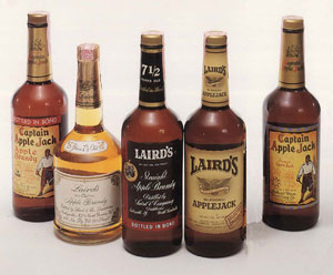
Drinkboston.com reader Adam Machanic emailed me recently with the results of some exhaustive mixological studies of apple-based spirits from Laird’s & Co., the oldest producer of America’s oldest native distilled spirit, applejack. In addition to applejack (a blend of 35 percent apple brandy and 65 percent grain neutral spirits that puts the “jack” in a Jack Rose), Laird’s produces Old Apple Brandy, aged in oak for 7 1/2 years, and 100-proof, bottled-in-bond apple brandy that’s also 7 1/2 years old. It takes about 20 pounds of apples to make just one of these bottles of pure apple spirits. Wow. Adam’s findings made me think, ‘Man, I’ve gotta get my hands on some of this stuff!’ and I wanted to share them:
“I ended up ‘experimenting’ my way through an entire bottle of the 7 1/2 year old brandy over the past several weeks, and I have to say, if science class experiments had been that fun I might have studied a bit more often. Seriously, though, it’s great stuff. Compared with the ‘smooth blend’ version, it hits you quite hard in the nose with apple essence the moment you remove the cap. Straight, it has a bit of sweetness, and is exceptionally drinkable neat or with an ice cube or two. Color-wise, it’s light, golden and exceptionally clear. Excellent in a Marconi Wireless with some good vermouth — but much better with Vya than with Punt e Mes; the latter overpowers it. I also thought it was wasted in a Jack Rose — the drink tasted no different to me than with the normal applejack. I really enjoyed it as an Old Fashioned, with 1/3 tsp of sugar, two dashes of Regan’s orange bitters, and a dash of Angostura.
“I enjoyed my experiments so much that I placed a follow-up order and got my hands on some of the 100 proof, bonded stuff. This is an entirely different beast — the liquid in the bottle has an almost rusty tone, and is slightly hazy compared with the brandy. And as an added bonus, there are a few floating specks of something in each bottle, visible if you shake it up a bit. Who knows what’s in there. The apple sensation is huge and overpowering both on the nose and the tongue, but thanks to the increased proof there is also quite a bit of heat — I don’t like this one neat at all. On the flip side, it stands up to the Punt e Mes just fine in a Marconi Wireless, and can even be a bit overpowering. I haven’t had a chance to do a Jack Rose yet, but that’s next on the list — I have high hopes for its success there.”
Many thanks to Adam for putting his liver to the test for the sake of experimentation. Unfortunately, he had to order the specialty Laird’s items online; I don’t know of any liquor stores in the Boston area that carry anything other than the blended applejack. Please, correct me if I’m mistaken.
Posted in Applejack, Cocktails | 11 Comments »
 Canadian Club, that once-respected whiskey that got pushed out of drinkers’ consciousness by the vodka tidal wave on one hand and the emergence of boutique ryes and bourbons on the other, is trying to make a comeback. The brand, now owned by Jim Beam, is running a catchy ad campaign in magazines like Esquire and GQ. Naturally, I wanted to include here an example of one of the ads, but I couldn’t for reasons I’ll explain in a minute.
 I attended a party recently that Beija Cachaca hosted at