January 18th, 2008
“Skip Intro” – Bad bar websites
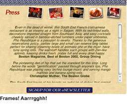
I love visiting bars. I hate visiting bar websites. One of the little-known drawbacks of being a drinks writer is the amount of time you spend searching for the Skip Intro button on restaurant, club and bar homepages. These sites are notorious for forcing on you a little Flash movie of the lounge area, or slide show of signature dishes and cocktails, complete with urbane musical accompaniment, before you are allowed to see the navigation. Then, when you finally get past the intro, you find yourself in a site that uses frames — those little windows, popular in 1998, that you have to scroll through — rather than separate web pages for each section. And don’t even get me started on menus in PDF. Nearly every bar and restaurant on the planet makes you download their menu to your desktop and view it in Acrobat. Is it asking too much to simply put the text on the actual web page? Oh, but wait, you’d need a web expert to hack into those damn frames…
 I didn’t set out to pick on anyone in particular here. The examples above were easy to find, and there are dozens more like them. That’s my point. Bad websites are rampant in this industry.
Regarding what I said about frames — it’s not that these sites look out of date. Most of them are quite slick. It’s that they act out of date. Mr. or Ms. General Manager, that flash intro may have seemed awesome the first time your web developer played it for you, but after the ninth time, when all you’re trying to do is take a quick look at the wine list, it’s annoying as hell. And the shoddy navigation on some of these sites can be comical. On the Beehive’s website, for example, click on Special Events (after watching that cool intro, of course). Where does that take you? Not to a list of special events, as you might expect, but to a page that says, “Beehive Special Events. Click here for more information.” Click there, and yet a third page opens in a new window with the info you’re looking for. Incidentally, I will be at the Beehive on the 27th to see Titler, who has a completely hallucinogenic website.
I know, restaurant folks don’t tend to have their fingers on the pulse of web technology. That’s why they’re mixing cocktails, cooking food and serving dinner, not sitting in an office. But what they need to understand is that if a potential customer visits their restaurant’s website, he probably landed there only after Googling, say, “sushi, Boston,” reading a few reviews on Chowhound and local blogs, and asking around the office to see if anyone has been to the place. At that point, all he wants to do is check out the latest menu and find the T stop nearest the destination. My advice? Give him a clean, easy-to-navigate website where he can readily find that info, because he wants to be wowed by your food, drinks and service, not your homepage.
Permalink | Filed under Books & resources, Boston bars |

January 18th, 2008 at 12:44 pm
As a librarian, the thing about flash interfaces that drives me crazy is that they make the restaurant much harder to find in Google. Douzo’s website, to take an example that’s driven me crazy in the past, is the 42nd result for “Douzo Boston” because it’s 100% Flash and there’s nothing there that Google can read. You would think at this point restaurants would understand that it’s better to be first in Google than have a slick-looking website.
January 18th, 2008 at 2:49 pm
OMG, you are so right, John. I totally forgot to include this huge point. Thanks.
January 18th, 2008 at 6:28 pm
You’ve nailed one of my pet peeves too!
Followed, only slightly, by sites that have old and outdated information.
Look at events… and they show you items from last summer.
Menu’s listed (in HTML if your lucky – dead on lauren) – but it’s their “September Specials”.
What are their hours? Well the site says one thing, the voicemail says another and the door says a third. (That’s aimed at one of my favorite watering holes 🙂 ).
If you’re not going to maintain the info on the site – it’s best not to put it up there in the first place.
January 18th, 2008 at 7:53 pm
Oh, outdated info. How naive of us to expect these websites to be accurate. Adam, don’t be afraid to mention by name the establishments who lead you astray. They need to know.
January 20th, 2008 at 5:05 pm
I hate to correct you on your blog, but as an ex-Web developer I feel compelled to point out that the Pho Republique site does not actually use any frames at all. The scroller on that site is delivered thanks to a DIV tag; very different from a frame, and much friendlier in terms of navigation, accessibility, and cutting and pasting text, than an actual frame… Notice, for example, that on the District Restaurant Web site — which does use frames — it is impossible to select text both inside and outside of the scroll area. OTOH, the Pho Republique site does not have that particular issue. Frames do suck, and scrollers might suck too, but let’s be accurate in our verbiage when criticizing… 🙂
January 20th, 2008 at 8:03 pm
Amen. When I search whether a restaurant has vegetarian meal options or cocktails I might like, I have come upon the same level of frustration.
Same with liquor companies. One recent exception was Blue Coat Gin which has a state by state breakdown of where they distribute to and when you click on Massachusetts it breaks it down by city to specific liquor stores with addresses. Bravo.
January 20th, 2008 at 11:35 pm
Whoa, Adam M. busted me for not double-checking my facts. D’oh! I knew I shoulda looked at that source code. I stand by my underlying point, however, that scrollers DO suck.