May 9th, 2009
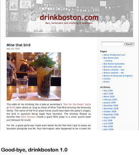
Drinkboston 2.0
 Welcome to drinkboston.com’s shiny, new package. A simple, default WordPress template served the site well for three years. But it was time for a more expansive design with cooler fonts and added features, like a randomly generated cocktail recipe and space for promoting events.
I gave web designer Noah Kuhn a stack of old magazines from the ’40s through the ’70s for inspiration. I’m happy with the result. Your thoughts?
Permalink | Filed under drinkboston in the news | Tags: drinkboston re-design

May 9th, 2009 at 2:26 pm
Looks beautiful! Lots of useful stuff now available right from the front page, nice.
May 9th, 2009 at 3:24 pm
Hey Lauren- Very easy on the eyes. Nice, tight upgrade.
May 9th, 2009 at 3:28 pm
Diggin’ the redesign, and I think the random recipe is a great idea.
May 9th, 2009 at 3:34 pm
Thanks for the feedback, y’all.
May 9th, 2009 at 6:27 pm
Clean, rad. I am psyched about the presence of the “Events” space.
May 9th, 2009 at 8:01 pm
Sweet Jesus Gahd!
May 9th, 2009 at 8:36 pm
Holy hell! I love the upgrade! Keep up the great work!
May 9th, 2009 at 10:05 pm
Looks great, but … Where’s the forum?? 🙂
May 9th, 2009 at 10:09 pm
Very nice, Lauren!
May 10th, 2009 at 3:52 pm
It’s excellent, Lauren! Nicely done. ~~C
May 10th, 2009 at 6:52 pm
Ah, I knew you’d ask about the forum, Adam. Still considering it…
May 11th, 2009 at 1:00 am
N-I-C-E…great job. Easy on eyes, easy to nav. Good job!
May 11th, 2009 at 8:15 am
Awesome, Lauren! It looks terrific.
May 11th, 2009 at 8:33 am
Nice work Lauren (and Noah)! I’m, very slowly, working through a site upgrade so I appreciate how much work the redesign was. Congrats!
May 11th, 2009 at 9:49 am
I enjoy the site redesign, but one quick question. When I am in a post, such as this one, how do I get to the main page? (I got to this page from off site, so the back button would not solve the problem.) Normally the logo links back to the main page, but that does not seem to be the case.
The random recipe section is a great idea.
May 11th, 2009 at 10:04 am
Dave, that’s strange. For me, the logo/masthead *does* link to the main page. Can you try again and let me know if the problem persists?
May 11th, 2009 at 1:27 pm
Well that was weird. Now it does work. I went to a few different pages on the site and none seemed to work at the time. Maybe it was my lack of coffee.
May 14th, 2009 at 9:20 am
LOVE it! Very professional work.
May 14th, 2009 at 11:53 am
Beautiful! Sweet!
May 17th, 2009 at 3:54 pm
Looks beautiful! Easy to read, with just a hint of 70’s shag carpet.